Setting up your own restaurant website can be tricky, but if you get it right, you’ll have a great chance of attracting new customers and growing your business! Great restaurants don’t just serve great food – they also have great websites that are easy to navigate and visually attractive to cater to casual diners and regular customers alike. When designing your restaurant website, think about these seven tips below.
1) Make it simple
When it comes to building your restaurant website, there are a few things you should keep in mind.
First, you want to avoid clutter and too many distractions. Keep the design simple and focus on the essentials.
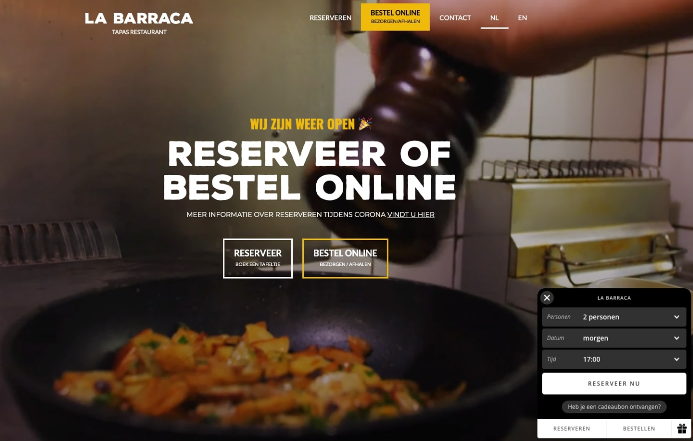
Secondly, make sure that navigation is intuitive. Thirdly, make sure to include contact information so that customers can get in touch with you for any questions or concerns they may have about their experience at your restaurant.
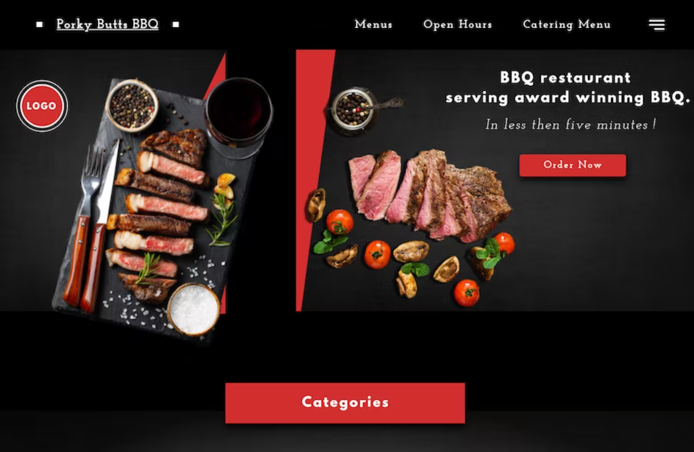
Lastly, be sure to include menu items with high-quality images so customers can see what they’re ordering before they do so.
2) Clearly define your restaurant’s niche
To build a successful restaurant website, you must start catering to your niche. What kind of restaurant are you? Are you a family-friendly establishment, or do you cater to college kids?
Once you know your target audience, you can build your website with them in mind. For example, if you’re targeting families and young children, use colors like blue and green that appeal to children and will be less likely to scare them away.
Let’s take a look at another example: if you’re targeting college students and millennials (a customer base who are often accustomed to using their smartphones for everything), provide contact information such as phone numbers, email addresses, etc., in the most prominent place possible, so they don’t have to scroll down too far.
3) Include photos of your restaurant in action

A great design is essential for any website, especially a restaurant website. After all, you want potential customers to be able to see your food and get a feel for your atmosphere.
Take pictures of the dining room as well as of dishes and menus. Keep it fresh with rotating images of seasonal specials, drinks, recipes, and anything else happening at the restaurant. Remember: it’s not just about what’s on the plate; it’s also about what people say about your food.
Share customer testimonials and reviews of meals at your establishment so people can get an idea of what others have enjoyed there before deciding to dine themselves.
4) Use responsive design so your website will be mobile friendly
As more and more people use their mobile devices to browse the internet, it’s important to make sure your website is designed responsively. This means that your website will automatically adjust to fit the screen size of the device it’s being viewed on. By using responsive design, you can ensure that your website will be accessible and user-friendly for all potential customers. Responsive design also ensures that navigation menus are easy to click on and that images are properly scaled to look great across different devices.
A great design is essential when building a restaurant website: every aspect, from fonts to graphics, should help cohesively tell your story while also conveying the atmosphere you want your restaurant to have. One of the most important aspects of this is deciding which colors work best with each other so as not only to please the eye but also to create a balance within a composition.
5) Promote authentic user reviews from previous customers
1. Talk to your previous customers and ask them to leave an honest review of their experience on your website.
2. Make it easy for them to leave a review by including a link to your Google My Business page or other review sites.
3. Display customer reviews prominently on your website so potential customers can see them when they visit.
4. Respond to both positive and negative reviews professionally.
5. Use customer reviews to improve your restaurant’s online presence and reputation.
6) Use high-quality images throughout your site
The first tip for building your restaurant website is to use high-quality images throughout your site. This will make your site look more professional and help it stand out from the competition. Additionally, images relevant to your restaurant’s theme will help you create a more cohesive overall design.
7) Organize information for easy navigation
Organizing your information in an easily navigable format is essential for any website, especially for a restaurant website. After all, you want potential customers to be able to find the information they need quickly and easily. Here are a few tips to help you get started

